Designing wayfinding for hospitals
by Rogier Coopmans,
13 August 2023

Hospitals are complex buildings, not just for the many services and destinations. Navigating unfamiliar surroundings – especially when one is already tense – can be stressful and time-consuming. Designing wayfinding systems for healthcare environments is one of the most challenging and rewarding work we do. These are our main learnings.
Make a connected experience
We see wayfinding as an – essential – link within an ecosystem of connected experiences. Within hospitals, these experiences comprise the quality of medical care, the comfort that patients experience, how waiting areas look, the clarity of information, and many other things. Wayfinding contributes to the overall experience of a hospital stay or visit.
A genuinely integral approach, however, requires intensive collaboration between different disciplines. From integrating IT systems such as registration kiosks and narrowcasting to information patients receive at home, from the brand identity and core values to the reception and waiting concepts.
Balance functional and emotional needs
Finding your destination in a hospital is a functional need; you have an appointment or are coming to see a loved one. But a visit also generates all sorts of feelings. Moreover, a medical centre is visited by many different people, each with their concerns, wishes and needs. So for wayfinding to work, it is essential to approach it from a functional and emotional perspective.
“Everyone will likely visit a hospital in their lifetime, but hardly anyone will want to be there.”
The wayfinding we created for Zaans Medical Centre is an excellent example of this. Based on a thorough analysis and following the principles of progressive disclosure, we designed an inclusive system that is integral to the entire patient journey while allowing for a sense of lightness in a serious environment.


Analyse and validate
Any wayfinding project starts with analysis. For a hospital wayfinding project, that means mapping all types of users, destinations and movements inside a hospital. Patient journeys help shape the strategy in the early development stages.
After the preliminary design stage, qualitative user testing validates the wayfinding strategy and -design. Putting the user at the centre of the design process supports the goal of empowering anyone to find their destination effortlessly, comfortably and independently.

Progressively disclose information
Patients, caregivers, and visitors are usually in a heightened state of anxiety and worried about finding the way to their intended destination in time. In these situations, people will need affirmation more often. Frequently asking hospital staff for directions only hinders them from their work.

The wayfinding system has been designed with the first-time visitor in mind, using progressive disclosure. The system reveals information in layers, providing the right amount of guidance to help visitors to the next decision-making point. Not more, not less.
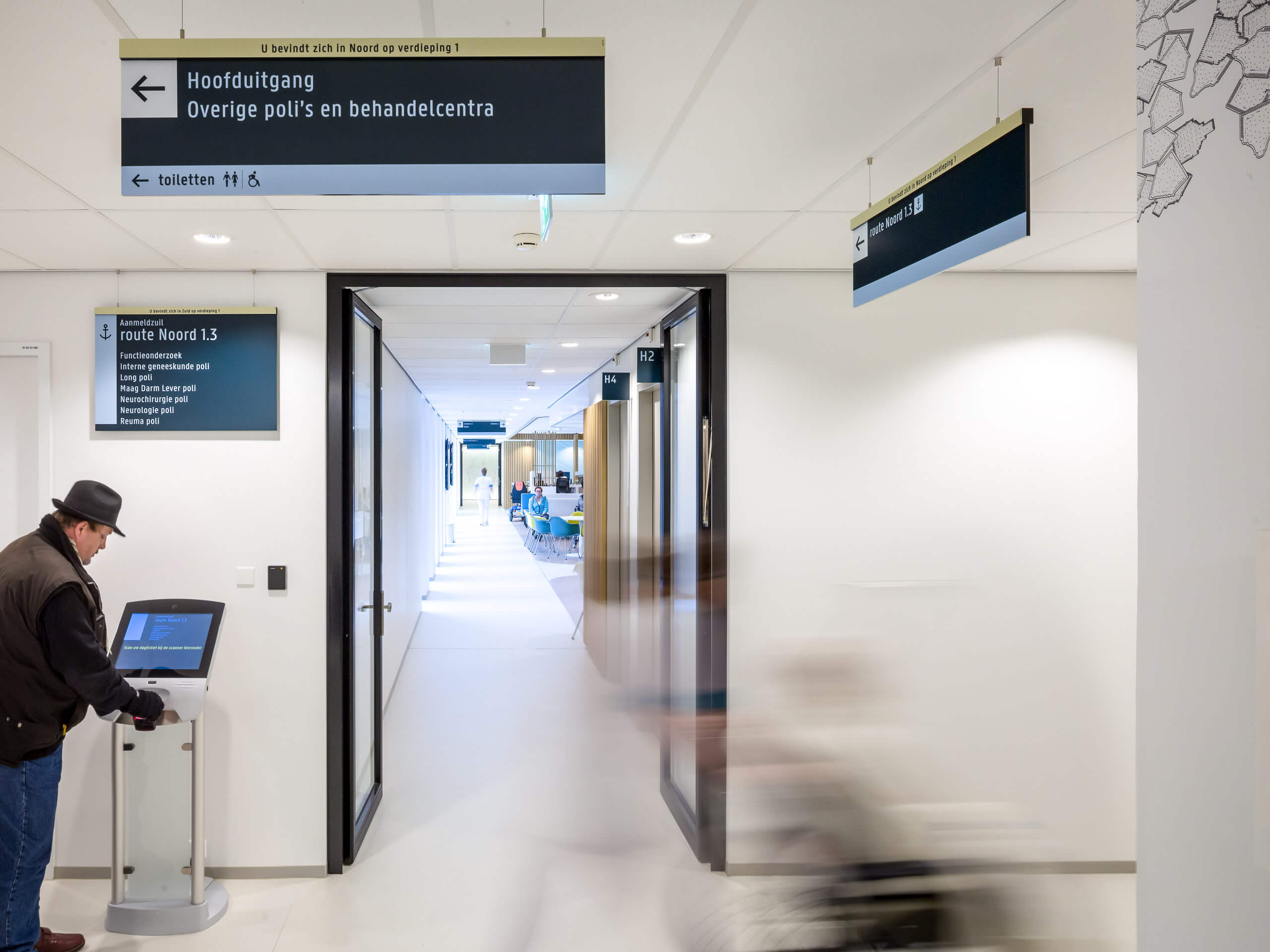
Guide patients from appointment to treatment
A user journey starts with the information patients receive at home. For an appointment at the Zaans Medical Centre, patients receive an invitation by mail. The letter includes step-by-step instructions on how to reach the destination in the hospital.

At the check-in kiosks, visitors receive a ticket with information such as the appointment, doctor, call number, and route number. The combined information allows people to decide for themselves where to wait and – for example – if there is time for coffee.


Everyone benefits from inclusivity
Everyone will likely visit a hospital in their lifetime, but hardly anyone will want to be there. It is quite a challenge to make the entire spectrum of people feel included and support them to find their way. Our basic principle is that wayfinding should primarily be language-independent. Names of out-patient clinics are often quite technical, long and complex.
Using pictograms and symbols, in combination with clear routes and lettering, a wayfinding system can be suitable for non-Dutch speakers and people with low literacy levels. For example: is there an anchor icon on your ticket? Just follow the anchor, and you’ll be going the right way.


Add a sense of lightness
Imagine large floor numbers, shaped of hand-drawn elements. They can be ornamental as much as functional and add a serene beauty. You can even remember the floor you are at by its illustration. Lightboxes with graphics at T-crossing can also assist navigation.


For children, we even went a step further. Functional wayfinding is not their primary concern. We used wayfinding, however, as an engaging opportunity to make them understand their doctor’s visit. The separate signage is placed close to the floor, encouraging children to playfully follow the green woodpecker, yellow squirrel, and blue rabbit.
Those elements represent a crucial ingredient to hospital wayfinding for us: lightness. Whereas a doctor’s visit is – most of the time – a serious affair, wayfinding doesn’t have to be just that. A sense of lightness helps to break the mould adding to a welcoming, bright and humane patient experience.


Questions about wayfinding for hospitals? Get in touch
Next level spatial branding Fontys Campus Eindhoven
